Term 4 2025
When exploring the theme ‘Landscape’ we went from the micro to the macro…from a tiny petal of a picked flower, to the vastness of ‘everything that we can see’. We focused on the landscape that was ‘right outside’ as well as our broader local landscape, depicted in photographs.
Botanical Illustration:
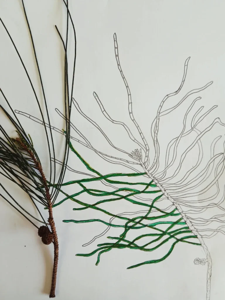
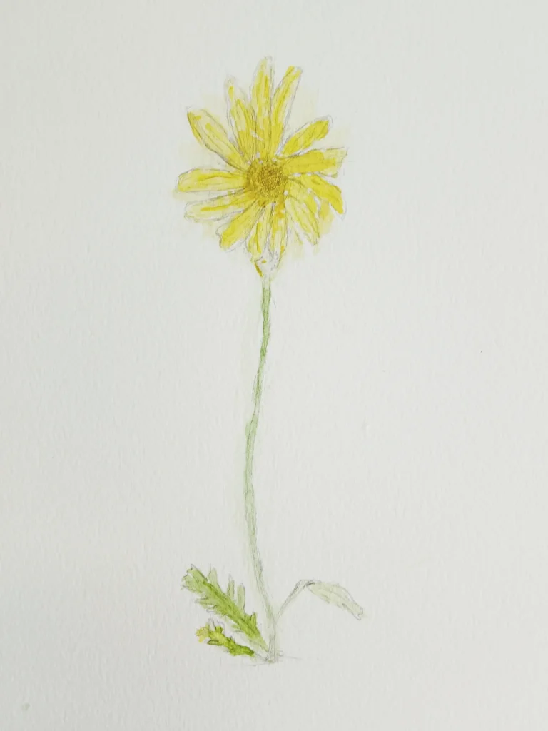
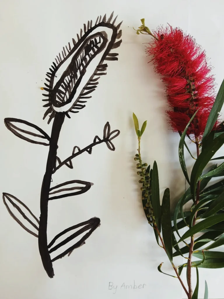
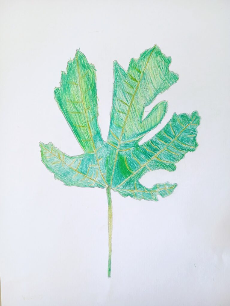
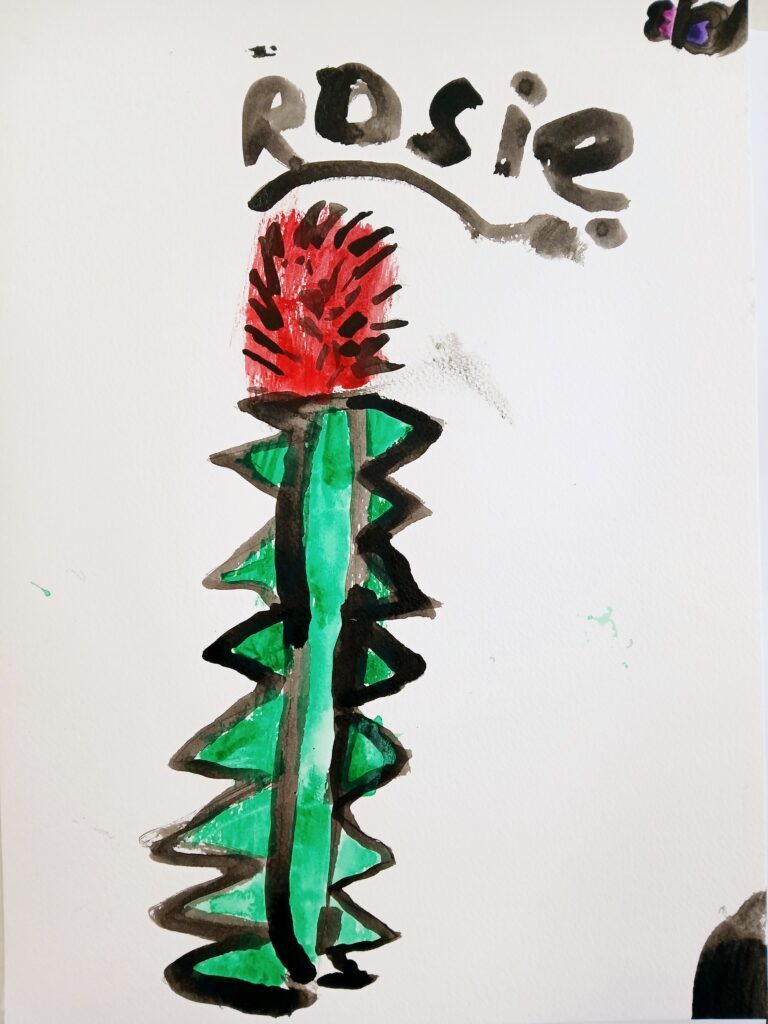
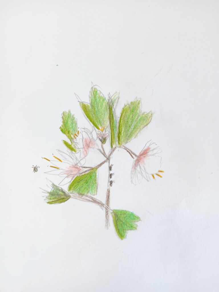
Little Artists and Young Makers (Mondays groups) began the term by training their eyes to observe the tiniest of details in the local landscape. They ventured into the local reserve and collected a variety of plants and leaves, with which they then created botanical illustrations in ink, watercolour and pencil. For the younger artists, learning to look ‘closer and closer…and closer’ was a new concept and they were prompted with ‘What else can you see? And what else?” until they noticed the hairs on the leaves or the ants crawling along the stems
Throughout the drawing process, the elements ‘Line’, ‘Shape’ and ‘Texture’ came to the forefront as Artists tackled with how to replicate their plant as best as possible. It was amazing to see the drawings become more and more life-like as they slowly trained their eyes to look deeper.
Botanical Illustration is always a winner. It amazes me at how much young artists thrive when given such a slow, detailed task – I think we are all hungry for the chance to do something meditative and peaceful.
‘En Plein- Air’ and ‘A la Prima’ (outside and In-One-Go)
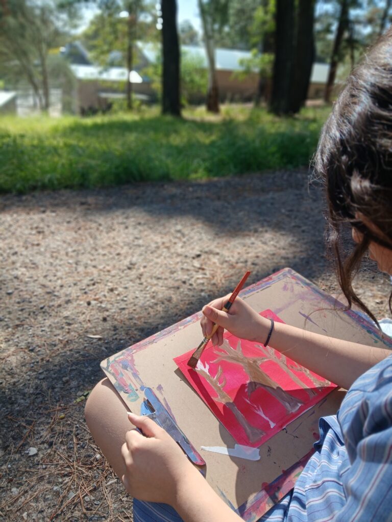
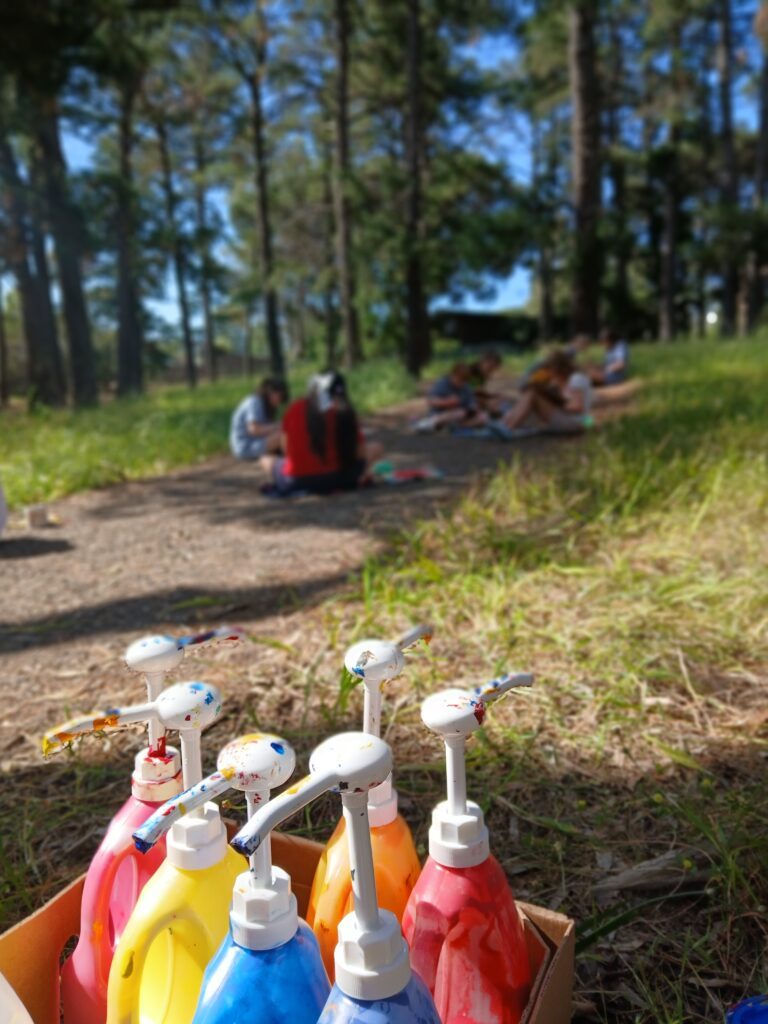
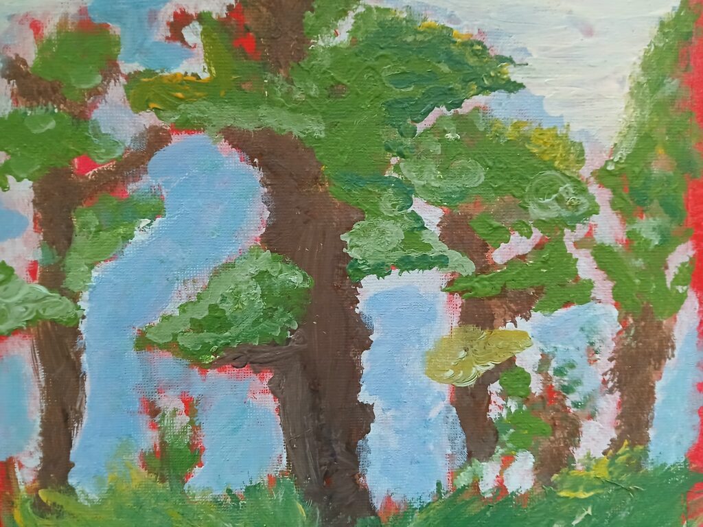
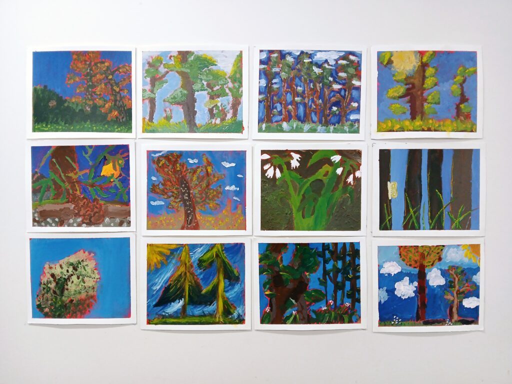
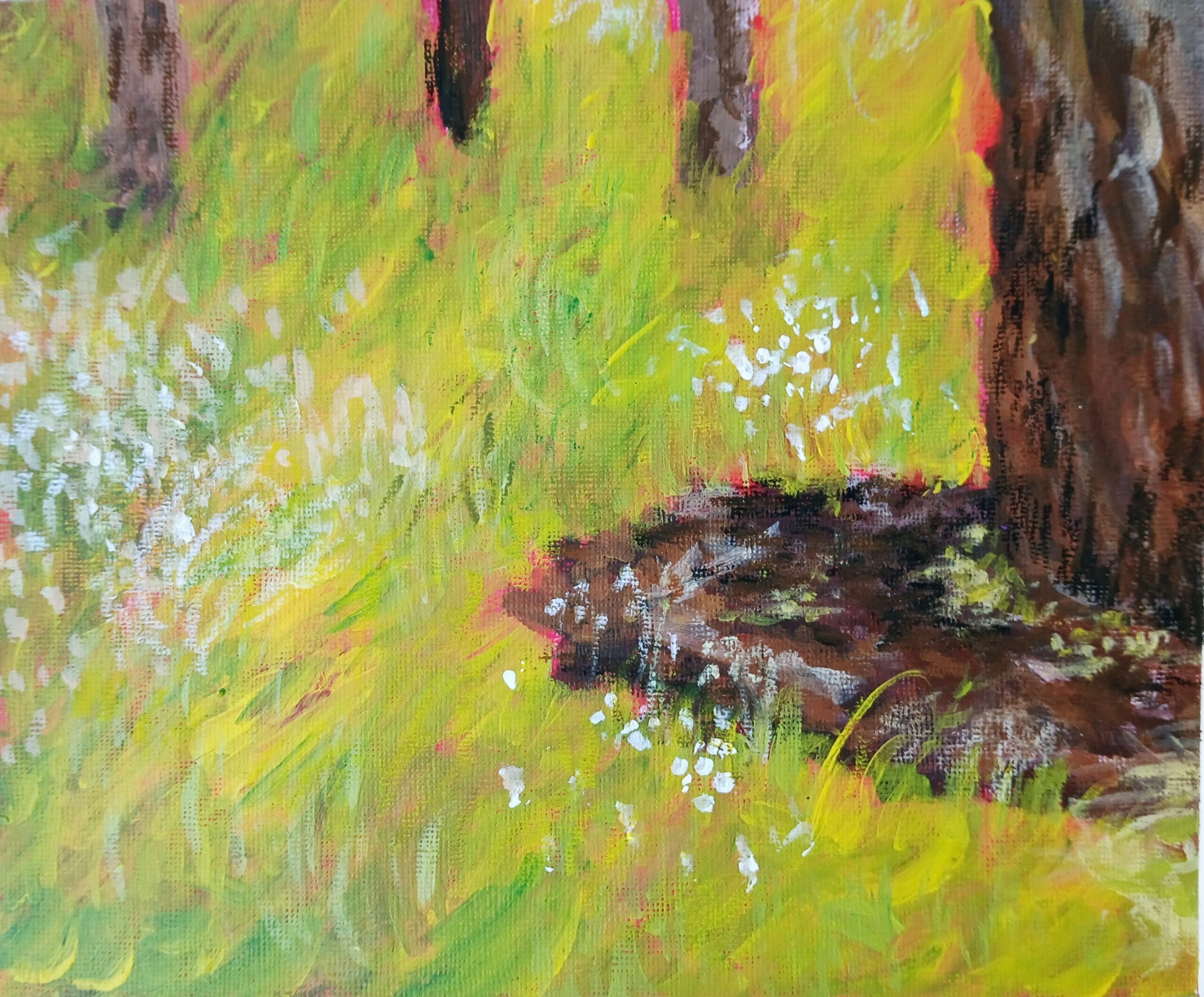
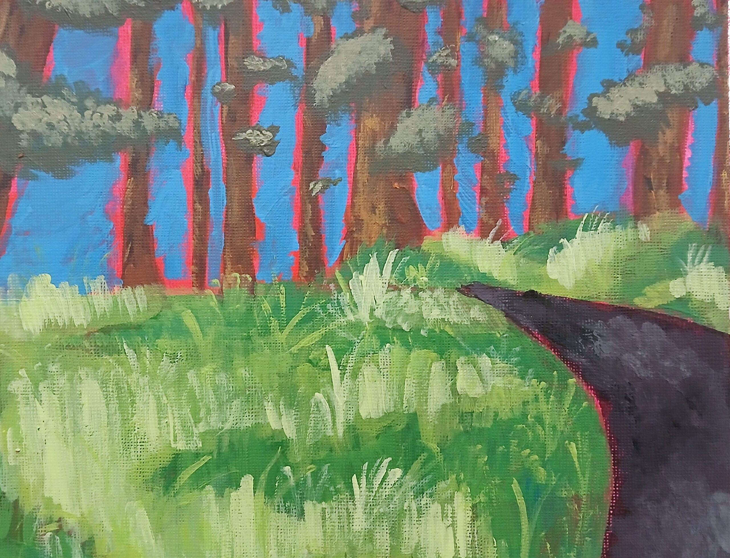
Wednesday’s Young Makers and Young Creatives spent the first few weeks tackling an ‘a la prima’ which is an Italian term for a painting thats done in one sitting. We sat outside in Pine Park which is behind the studio and were lucky enough to capture the vivid light and shadow that is characteristic of the end of Spring. For this painting, all the artists started with a red underpainting. Under-paintings are done for a variety of reasons, but this one was to play with colour theory – with the dominant colour likely to be green, the red is the contrast/compliment (sitting opposite on the colour wheel). By leaving sections of red, you create a dramatic vibration between the two colours.
Abstraction of Landscape
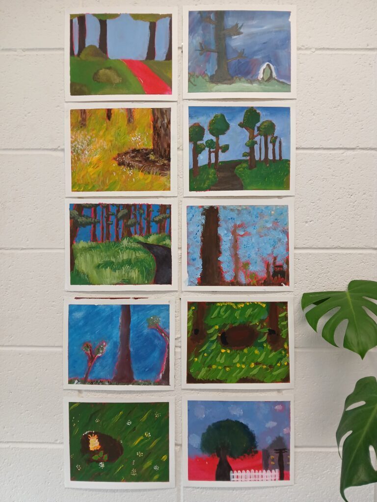
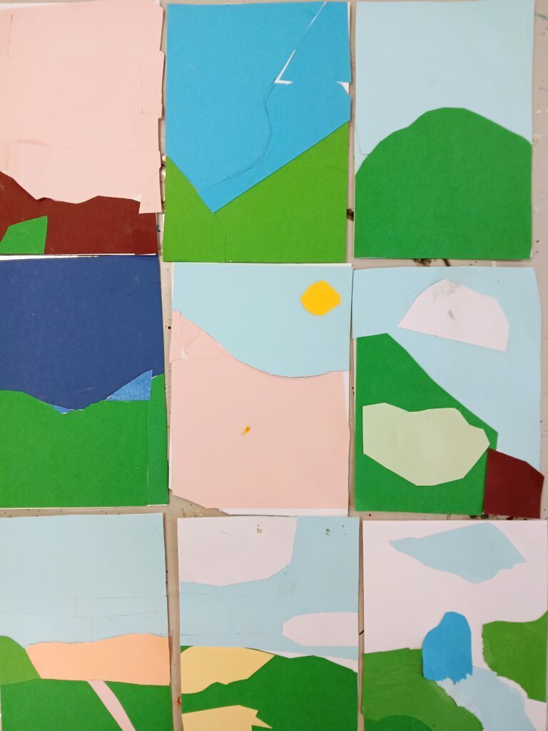
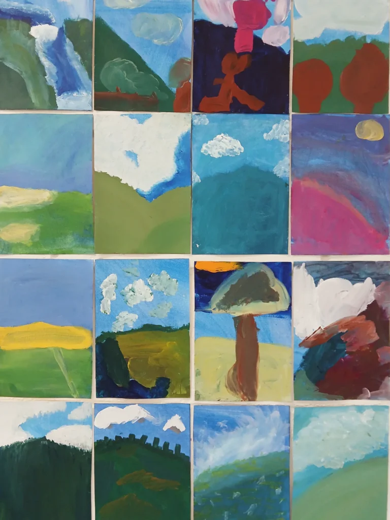
Monday’s classes looked at the Hadley’s art Prize and were drawn to a finalist Tony Scott who painted his hometown of Castlemaine in a series of works. We gained inspiration from these artworks and focused on the idea of simplifying a landscape into key shapes. This was the opposite of our first task of botanical illustration! We used photographs of the local Anstey Hill, Black Hill and Morialta hills as our reference, which most artists were familiar with. Artists were tasked to reduce their photograph into 3-5 shapes only, and to do so, they first created an artwork using collage. From this, they then created an acrylic painting, with a blue underpainting. The blue underpainting was chosen because we knew our artworks would be displayed as a collection, and therefore they would benefit from a sense of unity. The blue held all the pieces together as a ‘whole’.
Working Collaboratively
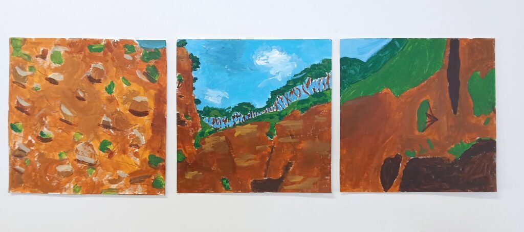
Wednesday’s classes also looked at the Hadley’s Art Prize and their favourite artwork was by George Cooley. We looked at several of his artworks and saw that he uses panels a lot like in this one, and we decided to do the same, on much much smaller canvases! For this, we worked in groups of 2-3, where each person painted one section. We used the same reference images as Mondays groups of Anstey’s Hill, Black Hill and Morialta.
Print making with plants
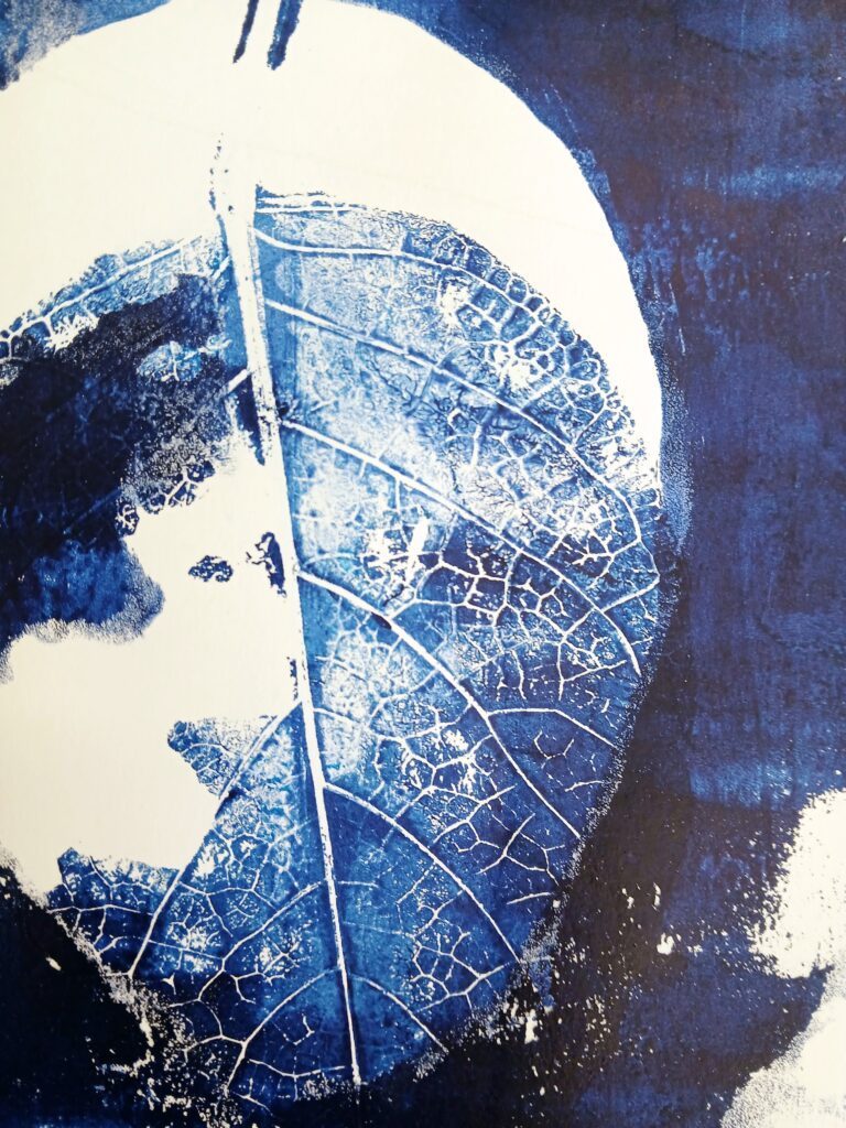
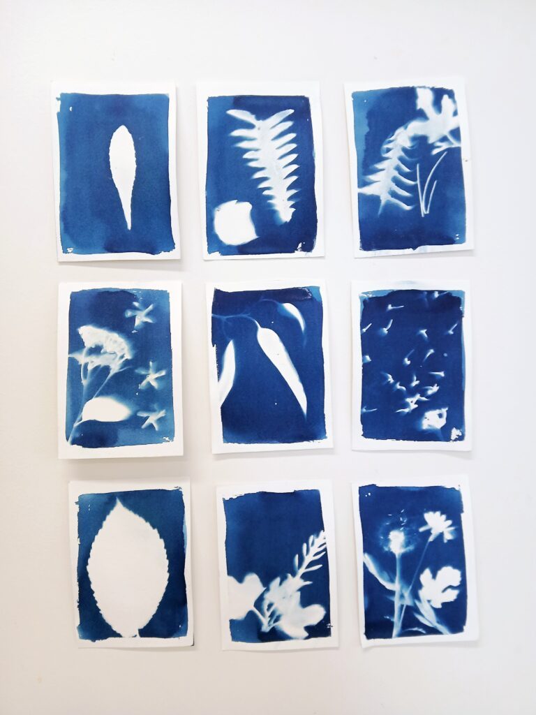
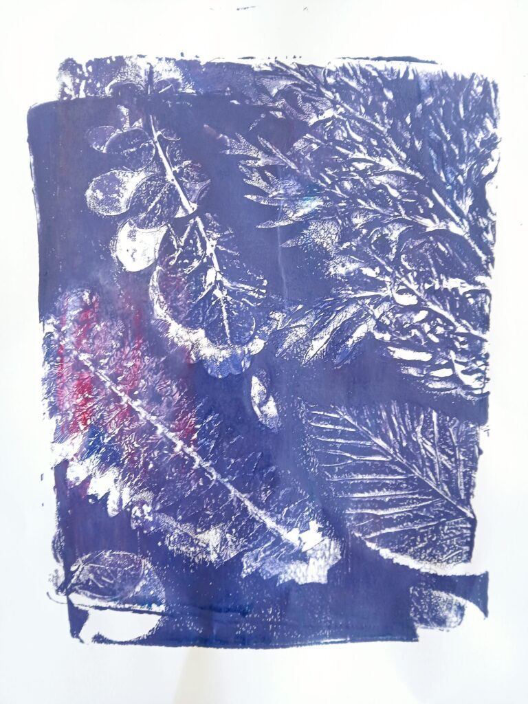
At the end of the term, we made prints with plants! Monday’s groups used Gelli-plate printing and Wednesday’s groups used cyanotype printing. These processes allowed us to focus on the shape and texture of plants which we collected from the reserve. It was a nice way to finish the term up, with lots of action and movement around the studio, enjoying each-others company before the big Summer break!